HEH$✨Script.
A HANDWRITING TYPEFACE MADE BY YOLLY
ABOUT

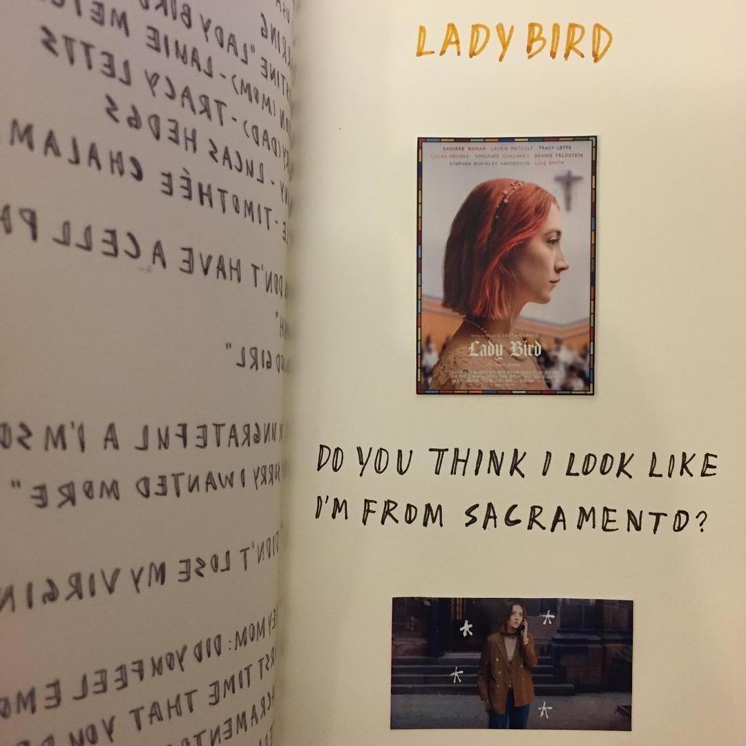
I’ve always been obsessed with people’s hand writing. Reading their writings is like deciphering their thoughts and sentiments. After learning about how Toshi Omagari made Sir Quentin Blake typeface, which is described “…doesn’t just look like his writing, it acts like it too ”, it immediately struck me by the gerund of my friend Hehe’s journal as it gave me a sense of tender & vigour.
I spent my last three days making this typeface, and here it is! Huge thanks to Hehe and all friendly and gifted individuals at type school :)
– Yolly 2018.07.26 @Tongji
FEATURES
ROUGHNESS

TRUE SCRIPTING EFFECT
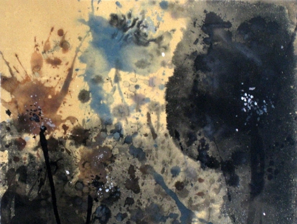
Roughness effect gives an authentic handwritten finish. A cleaner outline and smaller character set is also available. See the font in action here.
RICH VARIANTS

A balance between regularisation and randomness when creating alternative characters. As you type a letter, each one of the three variants appears in an order that avoids repetition of the same shape, making it appear random.
Multi-lingual

The addition of diacritical characters to cover Latin alphabets means it’s ready to take on broader challenges. See the full demo here.
LATEST POSTS
Type School Diary
CONTACT
If you want to use this font, you can access it via here.
Currently this font is still under development. I plan to expand its character set and refine its details. If you have any suggestions or requests , you are welcome drop me an email. I should be able to reply every evening =)
My current local time is .